Eye On The Sixties: Rowland Scherman

When I was working with Bob Korn to learn the rudiments of printing, Bob would take some time to show me what he was working on or to talk about some of the work that was on his wall. I was blown away by the photographs of ’60s music icons that Bob had up on the wall. It was work of Rowland Scherman. I like the photos of the Beatles at Shea Stadium but was stunned to recognize and realize that Rowland’s photograph of Bob Dylan was used for the Dylan Greatest hits album.

Chris Szwedo is now working on a documentary of Roland’s work and has a Kickstarter project to help with funding that is now nearing the last few days. Click here to find out more and contribute. Even if you aren’t interested in contributing I hope that you’ll check out a clip from the documentary below.

Friday Inspiration: Thomas Joshua Cooper

I’m intrigued by Thomas Joshua Cooper’s work, made with a 100 year old field camera, particularly that which documents the atlantic basin. In this project Cooper is charting the extremities of the land and islands that surround the Atlantic Ocean. As I understand it each photograph begins as a location that he finds on a map, this is then further researched before the trip which because of the typically remote location often involves difficult journeys by air, sea and land. Once on site Cooper makes only one photograph, the product of a lot of gazing and waiting.

Some of this work is captured in his book ‘True‘ that I’m now waiting for to arrive.

Check out the video of Thomas Joshua Cooper below:

Press Pause Play: Cary Wolinsky Interview

On my regular trawl looking for interviews of photographers talking about the creative process, the future of photography etc. I found an interview with Cary Wolinsky, a 30 year veteran of National Geographic and one of the founders of the Center for Digital Imaging Arts from the Press Pause Play Project. Check the interview out below. I’d be interested in your thoughts and comments about Cary’s view of where things are headed for today’s photographers.

Friday Inspiration: Jerry Uelsmann

Jerry Uelsmann is well known for his masterful photo-composites that are achieved in the traditional darkroom. While it is true that this kind of composite can now readily be created with the help of Photoshop, for me, few are able to create the kind of surreal masterpieces that Jerry has been able to produce over the years.

I plan to visit the exhibition of Jerry’s work ‘The Mind’s Eye: 50 Years of Photography by Jerry Uelsmann’ at the Peabody Essex Museum in the coming weeks. Check it out on-line here and read the Boston Globe review here.

Listen to Jerry talk about his photographic process in the video below:

For the full length video of Jerry discussing his work visit http://www.maurofiorese.it/ and also see his interview with Randi Lynn beach of PixChannel

Purple, The Most European of Colors

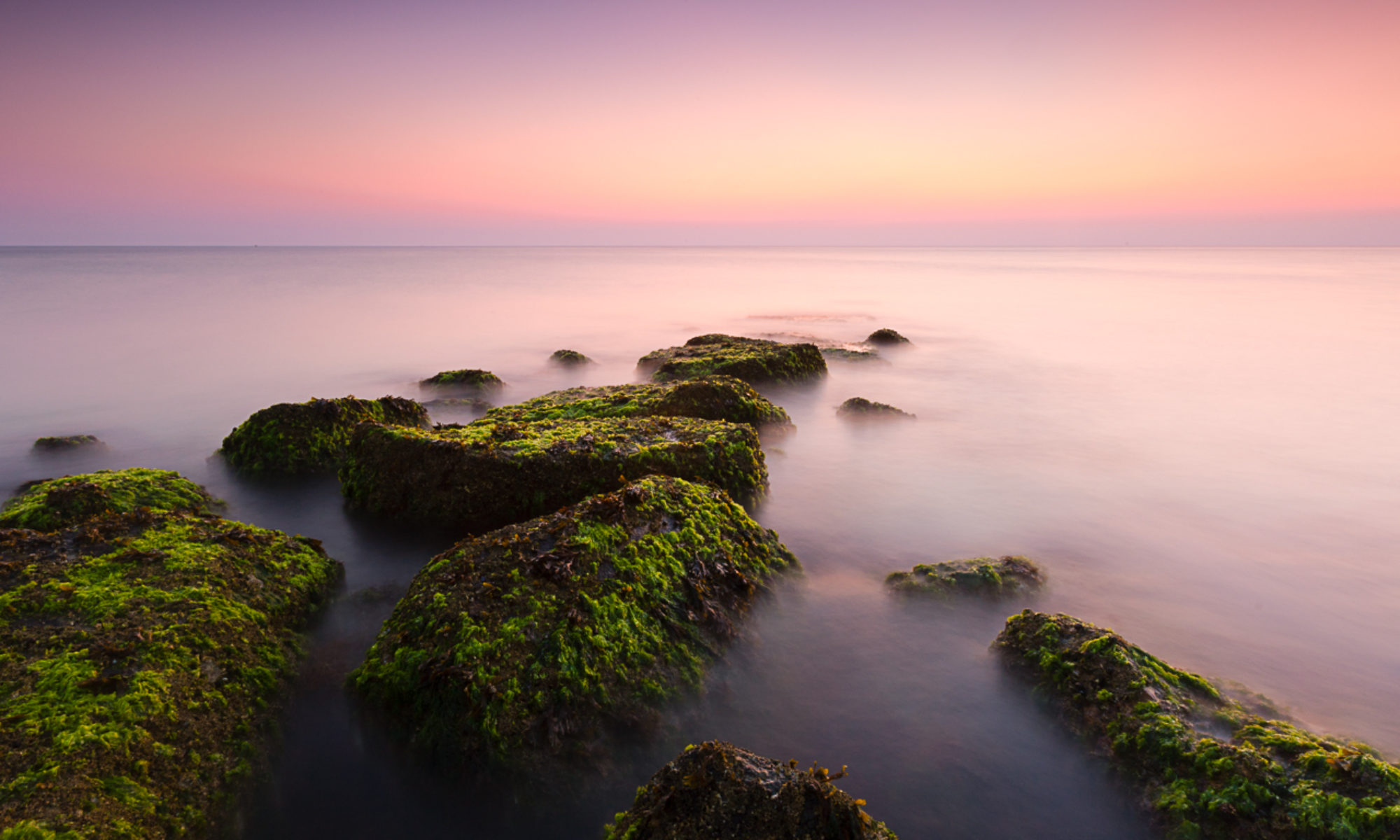
Increasing I find that while I’m happy to get up for the sunrise, I’m often less than pleased with the results. The vibrant colors that come with the early morning sunrise are increasing dissatisfying. While I can’t quite put my finger on why, purple bugs me the most. While I deal with my issues with purple, the most ‘European’ of colors, I’m trying out many of my images in black and white to see whether they can stand up on there own. I’m not totally sold on this solution but I’d be interested in your opinion of the black and white image above with the color ‘before’ image below.

In Service of the Print

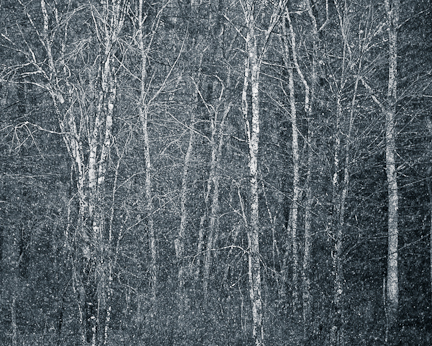
Winter Trees

‘Not every printer is a great photographer, every great photographer is a great printer’

Ansel Adams

I came across the quote attributed to Ansel Adams a couple of weeks ago and couldn’t help but wonder whether this is really true today. There have been seismic changes in photography and technology in the last 10 or so years – the shift to digital, decent cameras in most mobile phones, great tablet devices and on and on – that makes me wonder what was true when Ansel Adams made his comment is still true today.

How many people feel the need to print? Sure not people who are stock photographers. They deliver their content to the stock agencies digitally and it is further distributed digitally. Wedding photographers? Again another example of a group that are focused on high quality with high productivity, that would most likely today have some if not all content delivered digitally with the remaining photographs and associated wedding books printed by specialty print services. Editorial photographers, similar story – digital delivery to their editors.

Does this mean that these photographers are not ‘great’? Of course not. The successful photographers in these fields have exacting standards that when coupled with creativity and a capacity for hard work has been the foundation for their success.

So is Ansel’s comment still relevant today? I think so but we should modify it slightly – ‘Every great fine art photographer is a great printer’.

It’s never been easier to print your own photographs. Prices of really good ink jet prints have dropped precipitously and are well within the range of most serious amateurs. There are a huge range of ‘substrates’, papers and other specialty surfaces, available for printing. The standard printer drivers and paper profiles give good results without needing tweaking. Finally there are a tremendous range of resources available to help you along the way – George DeWolfe’s Book ‘George DeWolfe’s Digital Photography Fine Print Workshop‘ is one that I would particularly recommend. It’s quite possible then for us all to make good prints and with a commitment to the craft even some great ones.
Friday Inspiration: Rolf Horn

Rolf Horn‘s work caught my eye when I was recently poking around on the Soulcatcher Studio website.  I had been looking at the Paul Caponigro images that they have displayed there and decided to spend a few moments looking at the work of some of the other artists that they represent.

Rolf’s square black and white images, often long exposures, are reminiscent of the work of the other photographers that I enjoy – especially Michael Levin, David Fokos and of course Michael Kenna.  I perhaps shouldn’t have been surprised, although I was, to find that Rolf had worked as Michael Kenna’s assistant for a while.

Like Kenna, Rolf uses medium format cameras (Hassleblad) and film for his work, producing silver gelatin prints.  He is very much committed to this mode of photography, in fact if his comments regarding digital photography in this Black & White article when taken at face value are quite inflammatory – ‘thems fightin’ words’ as we would say where I grew up.  In addition the Black & White magazine feature, Rolf’s photography has been featured in a number of other magazines.  A full listing can be found here.

Rolf’s website is well worth exploring, there a large number of his completed bodies of work to dig into.  What I find interesting is that some of the portfolios date back to the early 1990’s and so as you look through it’s interesting to track Rolf’s aesthetic evolution.  His most recent work has a quiet energy that I particularly enjoy and I have to say it – his snow monkey picture (below) is one of my favorites to date.

Black & White or Color?

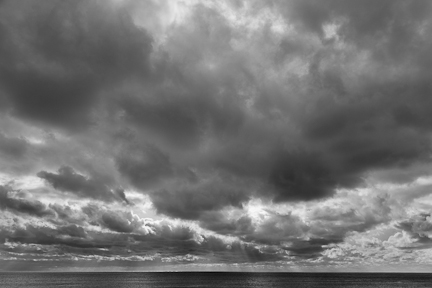
Black & white or color? This is not usually a question for me, I don’t see the world in black and white I see in color. Strong vibrant colors are what capture my attention and are what make getting up for sunrise worthwhile. However, I am increasingly finding that there are times when black and white seems better suited to what’s in front of me. The image above is a great example – it was quite a stormy morning, with impressive light on the horizon. When I took the photo it was with black and white in mind, there was very little color in any case. Which got me wondering, other than the obvious images where there’s little color anyway, how to choose between black and white and color? I could imagine wanting to use black and white when color is not important to the photograph, when it’s a distraction and when you want to emphasize texture.

When would you choose black and white over color? Why?

Labor Day Labors

One of the things that I like about digital photography is how easy it is to try things out and get immediate feedback. I have heard people say that they are switching back to film because the constraints of using film force them to be more creative. For a while I almost bought that argument. I do believe that all innovation is a creative response to overcome a problem, obstacle or constraint. Why not instead of retreat to film use digital technology under a defined set of rules? The instantaneous feedback that digital offers can then be used to adapt, modify or improve upon what you’ve just done. This past labor day I was playing with my usual walkabout lens the Canon 24-104 but using it at the wide end of that range just to see what I would get. I had fun, answered some questions and ended up with the image above. If all my labors were like this they wouldn’t feel like labor!

Friday Inspiration: Joel Tjintjelaar

I’m continuing on with my theme of photographers that shoot long black and white exposures today with Joel. Joel has an interesting website that has features tutorials for those people interested in pursuing the long exposure images that he’s known for.

I first became aware of Joel’s work through the Nik Software ad for Silver Efex Pro. In fact the video below is a Nik Software promotional video in which Joel discusses his intent and the process for realizing it.