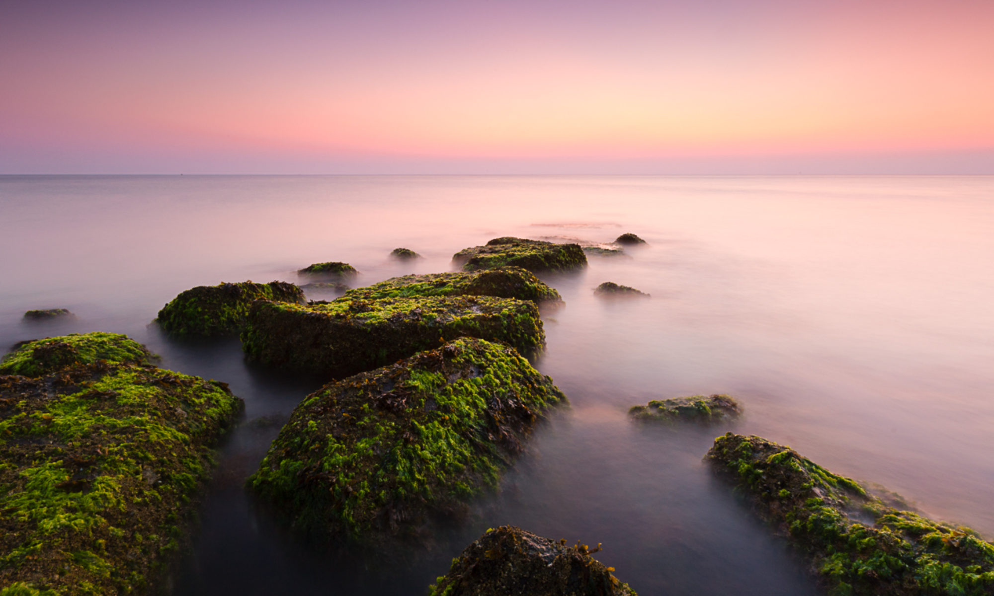

Black & white or color? This is not usually a question for me, I don’t see the world in black and white I see in color. Strong vibrant colors are what capture my attention and are what make getting up for sunrise worthwhile. However, I am increasingly finding that there are times when black and white seems better suited to what’s in front of me. The image above is a great example – it was quite a stormy morning, with impressive light on the horizon. When I took the photo it was with black and white in mind, there was very little color in any case. Which got me wondering, other than the obvious images where there’s little color anyway, how to choose between black and white and color? I could imagine wanting to use black and white when color is not important to the photograph, when it’s a distraction and when you want to emphasize texture.
When would you choose black and white over color? Why?
Hiya, Andy!
For me, the trouble is deciding when to leave an image in color! I’ve fallen in love with B&W, and now, most of my images are monochrome. My first reason was because it was simpler to make images without having to second guess what white balance to use, or if the colors were true-to-life. Oddly, I’ve come to truly appreciate color, but as a set of zone values. I see them better now because I’ve become aware of subtle variations. When I convert a color image to B&W, I can see the changes in zone values, and that clues me in to crypto colors in a scene. F’rex, there’s a hell of a lot of blue in granite! You wouldn’t know it to look at it at first, but take a snap and them play with it in Silver Efex Pro, by sliding the blue channel.
Some images are color by canon–Horsetail Falls, what would it be without that glowing orange/red/yellow water? But sometimes the light is there but the color isn’t, and that’s when I make images like this:
http://www.flickr.com/photos/ambitious_wench/6830246011/in/photostream/
Give it a try! Start converting EVERYTHING, and you’ll see possibilities all over the place.
Edie
I’ve only played a little with black and white conversions. The sliders in lightroom and photoshop really do give a sense of where and what the color really is. It can be quite surprising. I need to play with this more than I have!
Andy
Hi Andy,
I’ve been following your blog since George Barr mentioned it a few months ago. The issues you raise about the creative process are stimulating.
In addition to the reasons you give for choosing black and white, there is another factor to consider: abstraction. I recently encountered the black and white versus color issue for some images I have been working on. Your post has inspired me to reflect on the issue and write about my own experience on my blog, where I try to explain what I mean by abstraction. I also show two images first in color and then in black and white. It’s posted here. Thanks for the inspiration, Andy!
Lee
I forgot the link to my post. It’s http://leebackerphotography.wordpress.com/2012/02/10/callanish-stones-in-black-and-white/
Lee
Hi Lee,
Thanks for sticking with me and adding your voice to the conversation.
I’m adding abstraction to my list of reasons for black and white. You’ve probably heard the phrase ‘color is the enemy of shape’ as much as I have. Removing the color can emphasize shape and texture.
It’s almost worth trying all images in B&W as Edie suggested in the comments earlier.
Cheers,
Andy