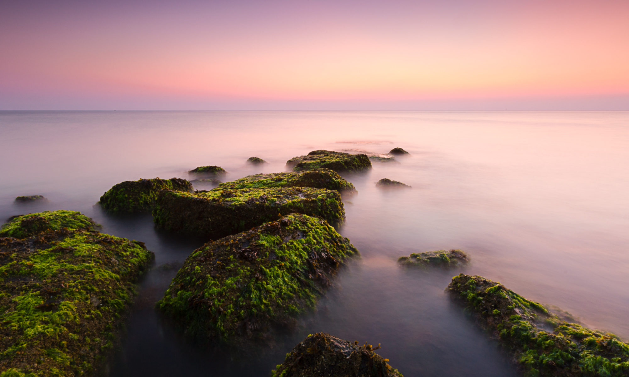

Increasing I find that while I’m happy to get up for the sunrise, I’m often less than pleased with the results. The vibrant colors that come with the early morning sunrise are increasing dissatisfying. While I can’t quite put my finger on why, purple bugs me the most. While I deal with my issues with purple, the most ‘European’ of colors, I’m trying out many of my images in black and white to see whether they can stand up on there own. I’m not totally sold on this solution but I’d be interested in your opinion of the black and white image above with the color ‘before’ image below.

…while I nearly always favor black and white, the color photograph is the winner in this instance, mostly on account of the texture of the foreground erratic.
I have to agree Andy… in this particular case…color wins!
I love black and white seascapes – in this case, though, I have to say I agree with the others. I feel like there isn’t enough going on in the sky for the mono to work well, not enough clouds and texture there. And the shadows in the lower left are more interesting in the color version.
It is the dramatic color that carries the shot, in my opinion.
I agree, the color shot is so much stronger!
I like the color as well. There is something about the texture on the rock in black in white that bothers me. I find in shots from the ocean, photos with lots of texture work well.
Thanks to everyone for chiming in here. Interesting to see an overwhelming agreement that the color image worked best. I’m a relative newbie to black & white and appreciate all the comments – they will certainly help inform my choices in the future.