Connecting with Your Voice

20120208-091845.jpg

I thought that it would be interesting to share here a pair of exercises that I did recently and one that I have continued with that is intended to help connect you with your story, your voice and your aesthetic.

As I mentioned previously we all see the world in a unique way and as a result we all have a different and interesting story to tell. One of the difficulties is owning that and being true to what you have to say.

Many of us haven’t spent the time to explicitly say – these are the things that attract me, these are the things that repel me, these are the things that I find energizing, these are the things that I find draining, these are the places that I feel most comfortable and in these places I feel uncomfortable.  Exercise 1 – go do that!  Carry a notebook around with you and make notes about where you are and why you’re responding in a particular way.

If that is the first exercise then the second is to acknowledge what photographers produce work that attracts and which produce work that repels you. Broaden that to include other visual artists, to designers – furniture etc., Then ask the question why they appeal or repel? Finally how is this aesthetic captured in your work.

Taking time to do these relatively simple exercises has helped shape my thinking about what I photograph and why. I suspect it may for you too.
Black & White or Color?

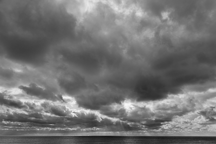
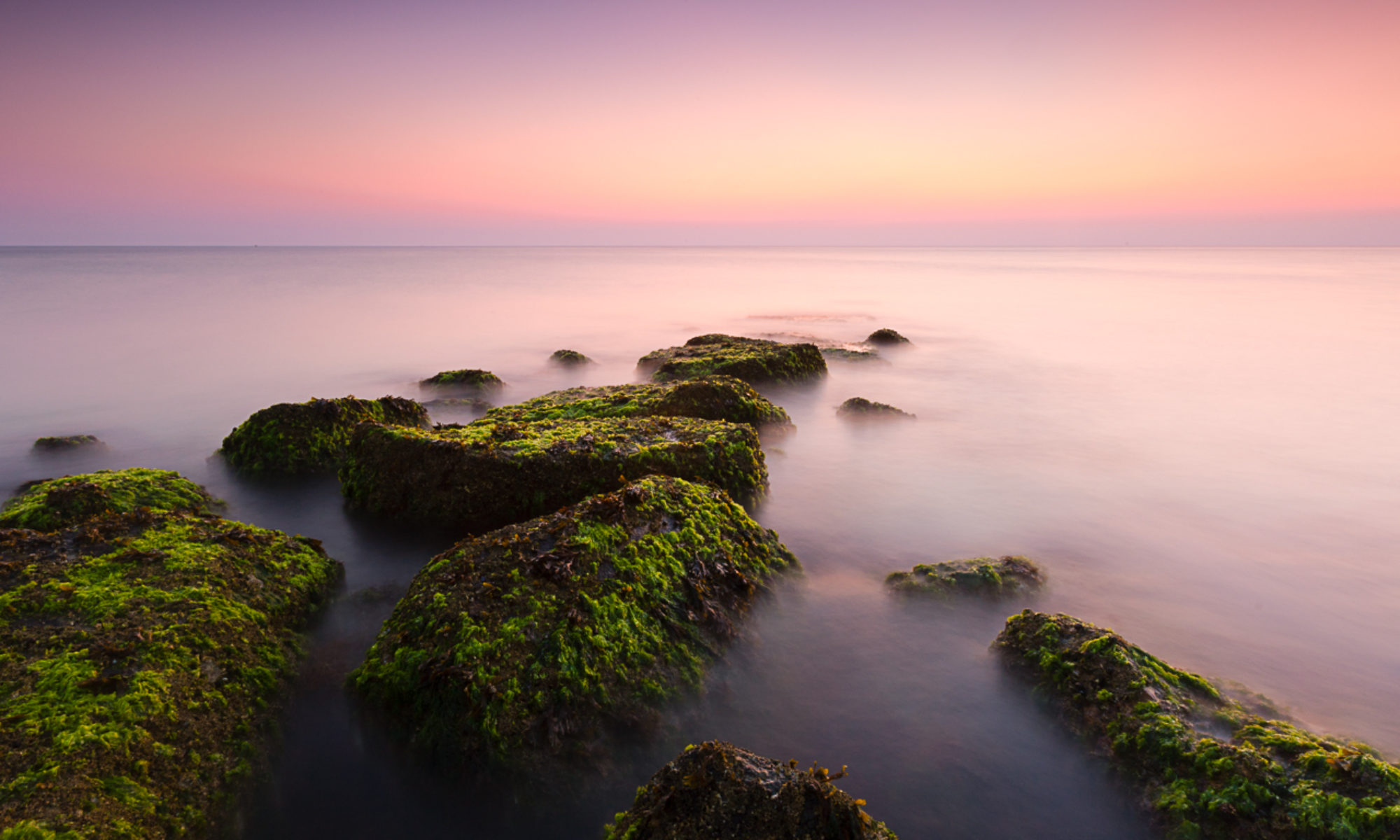
Black & white or color? This is not usually a question for me, I don’t see the world in black and white I see in color. Strong vibrant colors are what capture my attention and are what make getting up for sunrise worthwhile. However, I am increasingly finding that there are times when black and white seems better suited to what’s in front of me. The image above is a great example – it was quite a stormy morning, with impressive light on the horizon. When I took the photo it was with black and white in mind, there was very little color in any case. Which got me wondering, other than the obvious images where there’s little color anyway, how to choose between black and white and color? I could imagine wanting to use black and white when color is not important to the photograph, when it’s a distraction and when you want to emphasize texture.

When would you choose black and white over color? Why?

Friday Inspiration: The Shipping Forecast


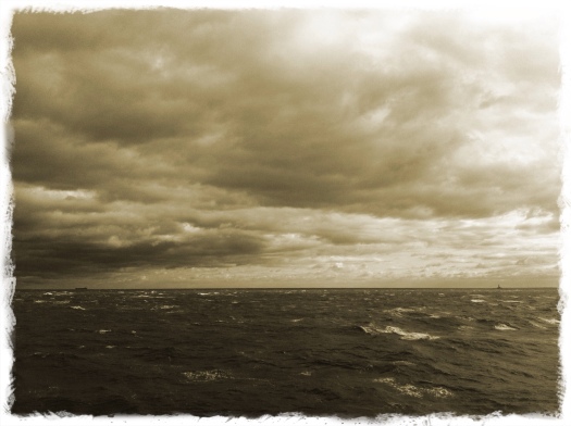
Growing up in the UK I often listened to the shipping forecast and could only imagine where places such as Dogger, Fisher, German Bight were. Magnum photographer Mark Power was also captured by the possibilities of these places and his investigation resulted in the project ‘Shipping Forecast’. View images from the project on the Magnum website here. An introduction to the project written by David Chandler can be found here. I recently came across a video for the project and thought I’d share that here.

The Importance of Story

20120201-091212.jpg

What do you think of when you see or hear the phrase ‘visual story-telling’? My mind immediately goes to the classic Life magazine photo-essays such as Eugene Smith’s ‘The Country Doctor‘, or the kind of article you might see in the National Geographic the Smithsonian magazine or my new favorite magazine Orion.

My reaction has also been that I don’t see the world this way, that I’m not trying to tell a story but look for things that resonate with me. That there’s no story here. In part that’s true but stories are all around us, whether we realize it or not. Any time there is a gap in our understanding we tell ourselves a story to explain it. Any time someone does something we like we tell ourselves a story. Any time someone does something that we don’t like we tell ourselves a story. The photographs that we choose to take do tell a story, whether that’s our intention or not. They tell people how we see the world.

The more we understand our own story the better placed we are to tell it to the world and the stronger this understanding the more likely that your work will be unique. My question for you then is ‘What’s your story?’

Beyond One Point Perspective – Putting Space and Time Into Images

I’ve been interested in figuring out how to give my images a sense of space, a feeling that you could step into them, and how I can play with time. I feel as though I’ve been making progress – using different kinds of lenses to get different effects and playing around with long exposures to give effects that can’t been seen.

Somewhat naively I thought that this was my unique struggle and so in digging into David Hockney’s work I was interested to read that he was wrestling with the same issues – 30 or 40 years ago. Hockney’s solution was the creation of photocollages. Perhaps the most successful of these was Pearblossom Highway, the image at the top of the page. When I had originally seen this and others like it I had thought that these were quite simple, knocked out in a couple of minutes. I didn’t realize the thought and effort that went into the making of it. Apparently the original shoot was done over the course of 8 days and then the assembly of the collage took another 2 weeks.

What makes this image interesting for me is that it plays with the notion of one point perspective that you would normally have in a photograph. This is done by changing position for each of the major elements in the photograph, for instance getting up on a ladder to shoot the stop sign. It gives an interesting effect. In other collages photographs of his friends and family taken during the course of an evening or afternoon capture their personality and the action.

I’m not intending to begin photocollages, just yet, but certainly food for thought.

Friday Inspiration: David Hockney

I’m sure that David Hockney is a familiar name to all. Some have told me that he’s the most famous painter alive today, perhaps that’s true but it’s not what I find interesting about Hockney. I first came across Hockney’s work in the late ’80s when he was making photocollages which I thought were interesting and set me on a path of doing ‘joiners’ whenever I had the chance. I stopped paying attention to what he was doing as life got busy and it wasn’t until when one of my friends recently mentioned that her work was moving close to the Hockney Gallery and Museum that I looked him up again. I was surprised to see that he’d relocated from Los Angeles to Bridlington, a small seaside town in East Yorkshire, and was busily painting the Yorkshire Wolds. This is very familiar territory for me and was a bit of a home coming to see the video and resulting pictures. What is particularly noteworthy is that he’s painting very large paintings outside. He really does manage to capture the essence of the place. If you’re in the UK his yorkshire landscape paintings are being exhibited at the Royal Academy from Jan 21 – April 9, 2012. Check out the video below.

Write a Page a Day and You'll Have a Book in a Year

I recently came across the following quote from Thea Astley:

‘If you write a page a day it adds up to a book in a year’

I like the idea here – steady and consistent progress will get you over the finish line. For photographers what does this mean? I think as it is for writers, doing something every day on your project will mean that eventually you’ll have a real and tangible product.

One of the harder tasks for us as photographers is being able to work on our project everyday, especially when we have the weather to contend with or difficult schedules to work around. I use the ‘Natural Planning Model’ that David Allen describes in his ‘Getting Things Done‘ book to go through and break out all of the tasks that a project involves. The natural planning model involves 5 basic steps:

1. Defining purpose and principles
2. Outcome visioning
3. Brainstorming
4. Organizing
5. Identifying next actions

Hear David Allen talk more about this by clicking below:

This allows me to generate an an inventory of everything that I could be doing to move my project along.

Using the book project that I’m working on at the moment as an example – assuming that the shooting will take care of itself, there are still lots of decisions around everything else to be made:

Self-publish?
What company?
Physical size of the book?
Hardback or Paperback?
eBook?
How many images?
Sequencing?
Introduction?
Other essays?
Thubnails at the end?
Shot information?

Once each of these questions has been answered there is then the obligatory question of ‘What’s the next step?’ Using this approach I have a laundry list of things that I can be doing when I’m not shooting to help help keep the project moving forward and I’m sure that you would too.

3 Things I like About iPhoneography and a Couple I Don't

20120123-103127.jpg

1. My Camera is always with me.

There have been so many times when I wished I had a camera with me and regardless of how small the ‘pocket’ camera is I never have a pocket big enough. My iPhone goes everywhere with me.

2. I’m ‘playing’ more than I do with a DSLR.

Along with having the camera with me all the time I’m trying things that I would never have tried with a DLSR such as shooting from unusual angles and trying out different types of processing.

3. Lomo

I’d never heard of the Lomo LC-A camera before I started using the Lomo preset in PhotoToaster. Now I’m half seriously thinking about getting one. Until then I’ll keep trying out the Lomo preset on all of my color images.

… and a few things that I don’t

1. Small file size and consequently small prints.

Some of the iPhone photos I’ve taken in the last year I love but I also know that I will struggle to make big prints from them.

2. Apps that dump data and make small files even smaller.

I love the Hipstamatic app but what’s up with the tiny files?

3. iPhoneography?

Really? That’s the best we can do? How about we just say photography?

Add your voice to the conversation – leave me a comment.

Friday Inspiration: Gerhard Richter

I’ve been taking a deep dive into the world of a couple of different painters over the Christmas holiday. The first that I wanted to share here was Gerhard Richter. For much of Richter’s early work he used photographs as source material. Many of these source photographs can be seen in Richter’s scrapbook of source material The Atlas. Some of these paintings are remarkably realistic. I must admit however that I like his abstracts much more. These are large scale paintings made with a tool of his own design. Click here to see a documentary that shows Richter talking about his photographs and at work making some of these large abstracts.

Book Module in Lightroom 4 Beta

There has been a good bit of fanfare surrounding the release of the beta version of Lightroom 4. One of the new features that caught my eye was the integration of a variant of Blurb’s booksmart software, making it possible to layout and then send to Blurb for production a book of your photographs. As someone interested in delivering my photographs to the world not just as prints but in the form of books this is a very cool development. While I frankly would have preferred the book module to be a generic layout tool not tied to any single book producer, perhaps pulling key features from Adobe’s In Design product, Blurb has a tremendous range of products that surely suits the needs of most, if not all, people interested in having a book of their photographs.

Check out the tutorials from the excellent Julieanne Kost below.