An Easy Way to Add a Second Display

IMG_0002.JPG

I am continue to tinker with my post-processing workflow, not that there’s anything intrinsically wrong with what I’m currently doing, just that I feel it could be better.

In looking what graphic designers and others who edit images for a living gravitate towards many seem to be using two displays and a tablet based editing system such as the Wacom Cintiq.

I’ve experimented with Wacom tablets in the past but they always seem to be more trouble thatn they’re worth. Perhaps if I made myself use the tablet for everything for a week it would start to seem as natural as reaching for the mouse does.

Wondering whether I would struggle to fully embrace a second monitor I was intrigued when I came across the air display app that allows you to use the iPad as a second display.

Having a second monitor means of course the ability to move the pallets section in photoshop to a second monitor, or to have a full screen image on one display and a zoomed in image that you’re working on on the other, or perhaps to use the iPad and an appropriate stylus as a budget Cintiq.

Seems like there are lots of reasons to try this option out and the cost of the app is much lower than that of an additional monitor. Have you tried using the iPad as a second display? I’d be delighted to hear your experiences if you have.

How the Right Software Can Recover Your Files

Nixon_110422_4218

When I’m on a photography trip I take all of the obvious precautions that I’m sure we are all taking with digital files. I have two card readers in case one fails, it will eventually and it can be a pain to replace depending on where in the world you are, I download the images to two separate places and have enough memory cards so that I don’t need to reformat cards until I get home.

What this system doesn’t account for is what happens when a memory card goes bad. This has happened in a couple of different ways for me. In one case the memory card wasn’t being read by the card reader but could be read by the camera. Easy fix – plug the camera in and download the images. Slower than it would be with a card reader but it worked. In the second case the card wasn’t being read by the card reader. The lights were on but no files appeared on my computer even after waiting for an age. It’s at times like this that the card recovery software that is often free when you buy the memory card is what you need to have. I foolishly always toss the unlock code for the software along with the other packaging materials from the memory card and so when I needed the software I didn’t have it. I ended up paying what felt like a lot to get a ‘free’ program. Fortunately this software worked a treat and I was able to recover all the images on the crashed card.

So the moral of the story is – if you haven’t done it already, the next time you get a new memory card make sure you download the card recovery software. It’s unlikely that you’ll ever need it but when you do it’s an absolutely blessing to already have it installed and ready to go.

Camera Profiles & Picture Styles

I feel like I must be the last person on the planet to have stumbled upon the utility of picture styles as they seemed to be called by Canon or Camera profiles as you might find them in the Lightroom Develop module. Do you use them as part of your raw file workflow?

Up to this point the first few steps following import of a photo into Lightroom have been to apply the lens profile, add a small amount of sharpening, crop & straighten if needed, set overall brighteness and adjust contrast. Then I’m over in photoshop for more adjustments.

I did play with picture styles a very long time ago and decided that they weren’t doing much for me. Since then I’ve studiously ignored them. When I have some time I will often click around prices of software just to see what things do. That’s what I was doing when I clicked through the various picture styles that are available beyond ‘Adobe’ that I had been using.

Adobe

Faithful

Neutral

Portrait

Standard

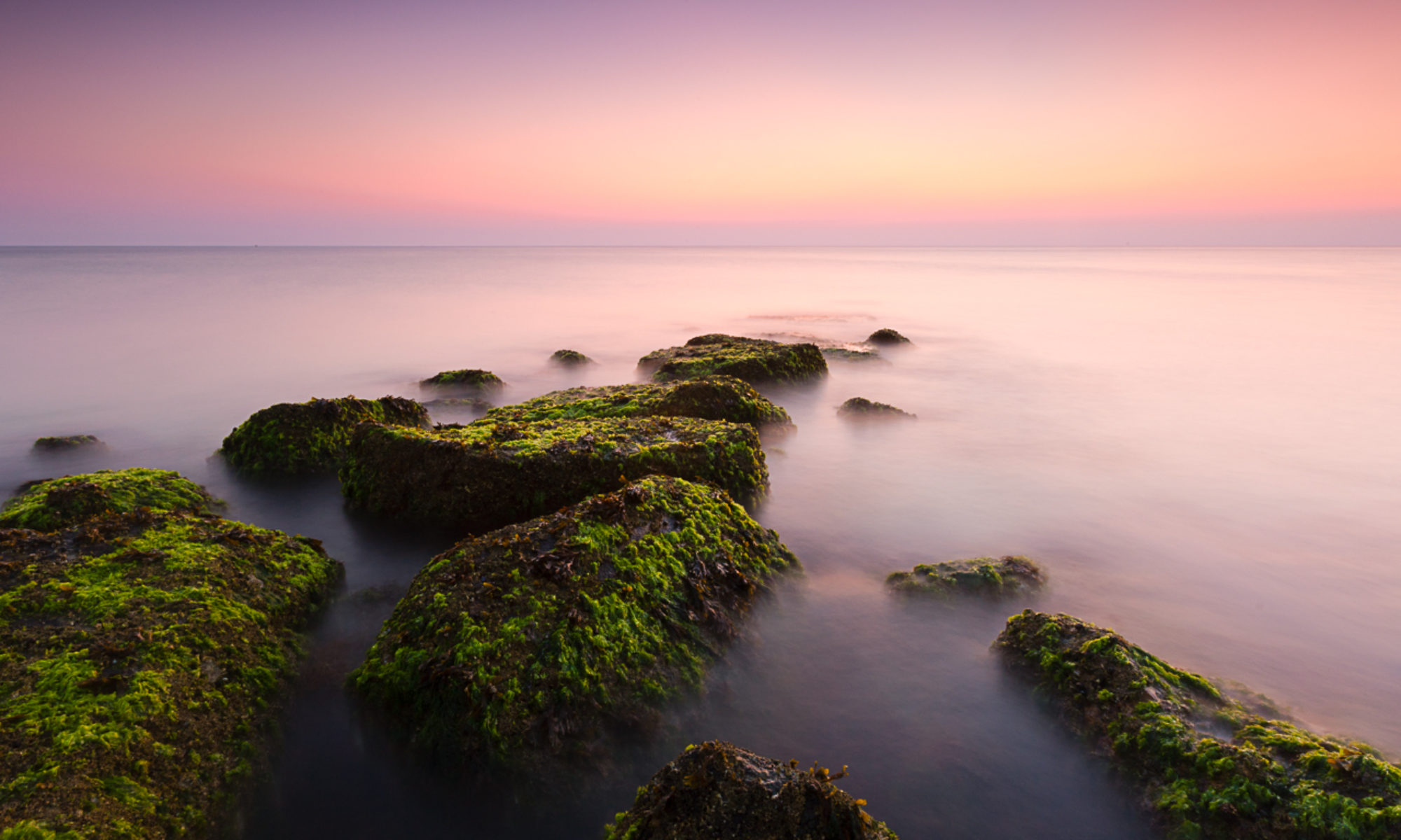
Of the 4 additional picture styles I feel like Landscape, used for the image at the top, gives me the best base to build from for this particular image. Still some work to do on this image but less than I would have had to do. Well worth a look.

iPhone Lomography – My Current Workflow

As I’ve mentioned before here, I’m having a blast working with the camera on my iPhone, largely pushing into territory I had previously thought was not for me. One of the presets that gives an effect that I like is ‘Lomo’ in the app Phototoaster. Not being a student of history it took me a while to realise that ‘Lomo’ actually refers to a camera, the Lomo LC-A, that has somewhat of a cult following. Characteristic photos from the Lomo LC-A have effects caused by light leaks, strong vignettes and rich, saturated colors. Often lomographers will shoot with slide film and cross-process to give strong color shifts. Take a dip into the Lomography photostream here.

While I mull over the purchase of an LC-A+ I’m going to continue playing with my iPhone. Read on to see how easy it is with the iPhone.

I am typically using Camera+ rather than the camera app that comes with the iPhone. Here is the image as shot. Lots of problems with this, my biggest criticism is that I should have been closer to crop out the sky and the trailer. You can zoom with Camera+ but be aware that it is a digital zoom – in effect you’re just using less of the sensor. If I have to crop I’d prefer to do it in software after the fact. I’ll admit that I think cropping is not a big deal particularly with my DLSR but is an issue with the small files that come from the iPhone, so try to get it right in ‘iPhone’ as it were.

The first step is to bring the file into PhotoForge and do some preliminary editing. Photoforge is a great app with lots of capabilities, curves, sharpening, cropping, textures, frames and effects and is one that I highly recommend. One of the neat things is that Photoforge has layers so you can work in a layer based manner if that is something that you’re used to. I generally am not using layers but I’m also just doing very simple edits. I will generally look at the levels panel and tweak there if I think the image needs it. In this case it didn’t a levels adjustment and so I moved on to add a bit of contrast using the curves function. I didn’t like any of the other tweaks that I might usually add and so I saved the file back to the photolibrary and jumped into Phototoaster.

I’m almost exclusively using Phototoaster now to add the Lomo effect. There is a Lomo effect in PhotoForge but it feels a bit washed out for my taste. I cropped the image to a square to remove the distractions and applied the Lomo effect which can be found …

I like the square but also wanted to see what else I could do. Here I didn’t lock the crop to a particular ratio and came up with this crop that I particularly liked and as before then added the Lomo effect.