Practicing at Practicing

Nixon_130515_4122-Edit

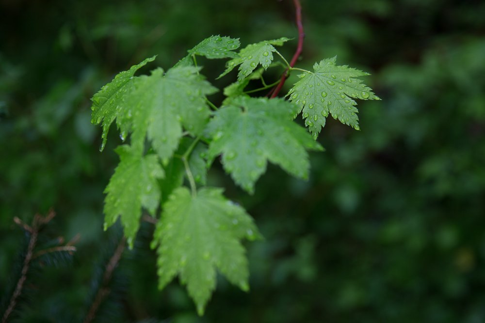
I recently upgraded my copies of Lightroom and Photoshop which of course brought with it the headache of making sure that all the plug-ins that I have for both programs were installed and working properly. In photoshop my plugins are ‘grayed out’ and unavailable to be fired up unless you have a photo open. So to solve that problem I opened one of the leaf pictures that I had intended on working on but hadn’t gotten around to it. I opened the leaf image and started OnOne Software’s “Perfect B&W’ plugin. I tried some of my favorite black and white presets. There are lots panels with lots of sliders that you can use to further tweak the image. One panel that I wasn’t familiar with was the ‘blending’ and so I spent some time playing with the various options and was surprised and pleased to discover that using the overlay mode gave me the image above. I liked it so much more than the image I started with which is below.

Nixon_130515_4122-2

Could I have gotten there with just Lightroom or Lightroom and Photoshop? Maybe… I realized that the image out of the OnOne plug in had a vignette (easy to do in Lightroom), and was a bit crunchy – had either a lot of contrast or clarity or a combination of the two added.

Adding a vignette was easy – I generally use ‘Post-Crop Vignetting’ and dialed in -33 using the highlight priority option in LR5.

Leaves_Vignette

Cruchiness wasn’t so easy. I thought that clarity would give the effect that I was looking for. Ramping clarity up to 100% gives the crunchiness I was looking for but there’s still something missing.

Leaves_Clarity

Adding a strong constrast curve gets us closer but the image is too green.

Leaves_Contrast

Finally desaturating a little using both saturation in the Presence panel and also the green slide in the HSL panel gives the image below.

Leaves_Desat

A vast improvement over the original and I like it better than my target image. I found this to be a useful exercise in exploring the power of Lightroom which I’m sure will come in useful.

Focus Stacking to Extend Depth of Field

Nixon_130516_4876-2
I thought that focus and depth of field were pretty simple. For things where you want to blur the background, focus on the subject, use a low F number (f4 or lower) and you’re good. For flat planes or things that are far away, focus on the subject and use a mid F number (f8 ish). For the grand landscape shot where you want front to back in focus, focus a third of the way into the scene and use a high F number (f22 or above).

This is probably as much as you really need to know to make very good photographs. However, like many things that seem to be simple, if you want to pick away at this and go deeper you can.

In the case of depth of field the only thing that is in focus in your photograph is that which you focused on and everything else on that plane. The rest of the stuff in your photograph that you think is in focus is actually ‘acceptably’ out of focus. For medium and large format cameras, cameras that have ‘movements’, that allow you to tilt the plane of focus this means that you really can get front to back focus, this is an application of the Scheimpflug principle. Those of us using DLSRs are out of luck unless we have a tilt shift lens that will allow you to do the same thing.

So, how to get front to back focus? Easy, take multiple images with different focus points and then blend them together in Photoshop to get what you want to be in focus, in focus. For this kind of shot rather than set the lens to f22, I would recommend that the f stop you choose be the one at which the lens you’re using is optically the best. As a rule of thumb this is usually 2 stops away from wide open, so for an f4 lens this would be f8.

So you’ve taken your shots – in this example I was exploring rain drops on some maple leaves. The images were shot at f4 to blur the background. In one image I focused on the front set of leaves and in the second I focused on the back leaves. Click on the images to see them larger.

Nixon_130516_4875 Nixon_130516_4876

The first thing to do is to open the images in photoshop and load them into separate layers. Once you’ve done that you can then go to the edit menu and select auto-blend layers:
Nixon_130610_

then stack images in the dialog box that appears next.

Nixon_130610_-2

This gives the blended image with good depth of field from the front to back leaves.

Nixon_130516_4875-Edit

A bit more photoshop to remove some of the distracting elements to give the final image.

Nixon_130516_4876-2

Look Behind You!

Nixon_130517_5332Look behind you is of course part of the standard audience participation in pantomime, a particularly English form of entertainment. It is also good advice to photographers because often good things are happening all around us and taking a moment to look up, down and all around can result in you spotting other good opportunities.

That was certainly the case for the photograph above. I was on the way to the Sol Duc falls and had stopped to photograph the mossy rocks that are part way to the falls. In taking a moment to look behind me I noticed that there was interesting light in the trees behind me. I shifted my attention to the trees for a little while and was fortunate enough to get a shot that, with the application of my standard B&W preset, resulted in the image at the top of the page.

So far I like this more than my mossy rock pictures and it just goes to show that looking behind you can pay off if you make a habit of it.

Friday Inspiration: Michael Zide

Zide2

I’m not sure whether Michael Zide would consider the image above to be his most iconic but it was the image that first caught my attention when I was leafing through a Maine Media Workshops catalog a while ago and then the one that I rediscovered last week. There are a number of things that I like about this image but I think the thing that struck me the most was the combination of ice and the ocean – I really got a sense of the cold when I looked at this image. It was also fun to realize that it was taken at Oak Bluffs on Martha’s Vineyard, one of my favorite places to photograph, and perhaps Michael’s too since he lived there for over 10 years.

The course that Michael teaches at the Maine Media Workshops is called ‘As You See It: Finding Your Creative Voice‘ which further caught my attention at the time and is on my list a potential future workshop.

Zide_Woods_in_Snow

Check out more of Michael Zide’s work here: http://www.michaelzide.com and take a walk with him as he photographs Buffam Falls in the video below.

Friday Inspiration: Johsel Namkung

namkung

When I was planning to go to the pacific northwest, and particularly the Olympic National Park, last year I began casting around for inspiration and to see what others had done in this area. Art Wolfe was obvious since it was his workshop that I was going on. Jay Goodrich too since he was also one of the workshop leaders but who else. That was when I came across Johsel Namkung, a photographer who some have suggested is ‘Seattle’s answer to Ansel Adams‘. I think I would disagree and suggest that Namkung has more in common with Eliot Porter than he does with Ansel Adams. When I think of Ansel Adams I think of the grand landscape captured in black and white, whereas when I think of Eliot Porter I think of more intimate images captured in color. For me Namkung’s most powerful images are color studies of shape, line and texture.

A restrospective of his work was published by Cosgrove Editions in 2012. You can browse the book here and find out more about him at johselnamkung.net. Check it out, it’s worth a look.

Getter Better All The Time . . . Couldn't Get Much Worse

Nixon_121123_4028

I’ve been thinking about learning in the last couple of weeks and have become increasing comfortable with the notion that 20% of our efforts give 80% of the results, or knowing 20% of something can get you 80% of the way there. For many people this is good enough, with the disproportionate amount of effort it takes to go the last 20% of the way not worth the effort it takes.

For the longest time I wanted to take better photographs without really a notion of what better really meant. Even now I’m not sure what better really means but I’ve settled on it being sufficiently skilled that I can conceive of an image and realise that in the final image. I’ve started to realize that for me this is a little bit like looking for the end of a rainbow. What I’ve found is that the more skilled that I become, the more that the technical stuff falls away allowing me to spend time on the artistic piece, the further and harder I push. What was difficult becomes easy and uninteresting. The new challenge is the thing that stretches and tests your abilities both technically and artistically. Failure, frustration and disappointment remain part of your everyday existence. Perhaps those failures become more spectacular as your skills develop and you try and push to bigger things. But failure remains a constant, intermingled with some successes and it’s those successes that make it all worthwhile.

So how to get better when better remains an unachievable goal. There are of course stages to this growth. Arguably imitation is the foundation of all that we do. We look at those artists that are making the kind of work that we’re interesting in and ask the question how do they do it. We work the technical side of things and figure out how they did what it was that attracted us and make servicable copies of the work of the masters. Great examples of this are the multitude of photographers that make the pilgrimage to Yosemite each year to make their own copy of Ansel Adams great photographs. That’s pretty cool – execute one of these photographs immaculately and you’ve got a pretty nice looking photograph that your friends and family will most certainly coo over.

I would argue that the next phase is to build a familiarity with the things that appeal to you. This covers the gambit of design sensibilities, aesthetic qualities in everyday life – furniture, tools that you use everyday – computers kitchen gear, dishwear, cutlery etc. as well as becoming encyclopedic in your familiarity with the medium that you work in – landscape photography, portrature, etc. and perhaps digging depper to sub specialties such as water in the landscape.

The final and perhaps hardest step then is to combine the technical and the artistic to create something that is truely your own.

I’m going to unpack my thoughts around getting better over the next few weeks. Comments appreciated as always. Thoughts on the 80/20 rule in relation to skill development? I’d love to hear them.

Art Wolfe's Olympic Peninsula Workshop Comments


Or I just flew in from Seattle and boy are my arms tired.

I recently attended Art Wolfe’s Olympic Peninsula workshop. What an amazing place the Olympic Peninsula and the Olympic National Park is – Rain forest, Mountains and the ocean. What more could you ask for? It was quite an experience.

I was expecting a relatively intimate workshop (I had been under the impression that it would be 12 people) that would give us all a lot of time with Art and Libby and Jay. It turned out to be a much bigger group, ~30 participants and 4 or 5 additional instructors/assistants. Not that is a bad thing, the staff were all pretty attentive both in the classroom and in the field, although I found it difficult to keep track of peoples names, whether they were with our group or not and whether they were a participant or instructor. We didn’t spend too much time in the classroom because the weather was ‘perfect’ for photography, it was overcast the first day, overcast and rainy the second, but then cleared so that we got broken cloud cover for a sunset at Second beach. Very cool the way the weather worked out perfectly.

One of the reasons that I took the workshop was to get a better sense of photographing in forests and there was no shortage of opportunity to photograph in the forest. Our first stop was Marymere falls and then on to the Sol Duc. Being in dense old growth forest I was overwhelmed by the clutter and so it wasn’t until I was in the Hoh Rainforest the following day that I actually started seeing potential shots. But then however I was battling a couple of technical challenges that I hadn’t expected – it was raining, hello rainforest – which meant that I had to clean off the front element frequently otherwise my shots would be obliterated because of raindrops. The second issue that I was frankly surprised by was fogging. I was using a polarizer to take the sheen off the green and found that the front element would fog under the polarizer and so I had that to contend with too. Most if not all of the shots of the forest I ended up with are marred by one or other of these issues.

While I may not have any photographs from the forest that I liked, I did begin to ‘see’ potential photographs which was a significant step forward for me. I’m looking forward to going back for more!

Black & White – Winter Trees

I’m still futzing with making black and white photographs. The winter trees above taken during a rare (at least for this winter) snow flurry is my latest effort at black and white. A little easier to visualize this time since the subject is ostensibly black and white. Comments as always appreciated.

I’m not exactly comfortable with the try it and see approach, although that will surely work, and so I have been looking around for tools and resources that could help educate and train my eye. The book ‘Seeing in Black and White‘ by Alan Gilchrist seems like it would give a solid theoretical understanding and was recommended by Vincent Versace in his recent interview with Ibarionex Perello on The Candid Frame. I’m also looking forward to seeing Vincent Versace’s book on black and white conversion techniques, ‘From Oz to Kansas: Almost Every Black and White Technique Known to Man‘, which should appear in the next couple of months.

The tool that I’ve found that looks intriguing is the Tiffen #1 B&W Viewing filter, essentially a Kodak Wratten 90 monochromatic viewing Filter but in a more user friendly holder. Apparently it is able to remove the color and gives a monochromatic view more like that which would be captured by black and white film. Sounds intriguing and I can’t wait to give it a go. Read more about the filter in an excellent article by George DeWolfe here.

In Service of the Print

Winter Trees

‘Not every printer is a great photographer, every great photographer is a great printer’

Ansel Adams

I came across the quote attributed to Ansel Adams a couple of weeks ago and couldn’t help but wonder whether this is really true today. There have been seismic changes in photography and technology in the last 10 or so years – the shift to digital, decent cameras in most mobile phones, great tablet devices and on and on – that makes me wonder what was true when Ansel Adams made his comment is still true today.

How many people feel the need to print? Sure not people who are stock photographers. They deliver their content to the stock agencies digitally and it is further distributed digitally. Wedding photographers? Again another example of a group that are focused on high quality with high productivity, that would most likely today have some if not all content delivered digitally with the remaining photographs and associated wedding books printed by specialty print services. Editorial photographers, similar story – digital delivery to their editors.

Does this mean that these photographers are not ‘great’? Of course not. The successful photographers in these fields have exacting standards that when coupled with creativity and a capacity for hard work has been the foundation for their success.

So is Ansel’s comment still relevant today? I think so but we should modify it slightly – ‘Every great fine art photographer is a great printer’.

It’s never been easier to print your own photographs. Prices of really good ink jet prints have dropped precipitously and are well within the range of most serious amateurs. There are a huge range of ‘substrates’, papers and other specialty surfaces, available for printing. The standard printer drivers and paper profiles give good results without needing tweaking. Finally there are a tremendous range of resources available to help you along the way – George DeWolfe’s Book ‘George DeWolfe’s Digital Photography Fine Print Workshop‘ is one that I would particularly recommend. It’s quite possible then for us all to make good prints and with a commitment to the craft even some great ones.

Friday Inspiration: David Hockney

I’m sure that David Hockney is a familiar name to all. Some have told me that he’s the most famous painter alive today, perhaps that’s true but it’s not what I find interesting about Hockney. I first came across Hockney’s work in the late ’80s when he was making photocollages which I thought were interesting and set me on a path of doing ‘joiners’ whenever I had the chance. I stopped paying attention to what he was doing as life got busy and it wasn’t until when one of my friends recently mentioned that her work was moving close to the Hockney Gallery and Museum that I looked him up again. I was surprised to see that he’d relocated from Los Angeles to Bridlington, a small seaside town in East Yorkshire, and was busily painting the Yorkshire Wolds. This is very familiar territory for me and was a bit of a home coming to see the video and resulting pictures. What is particularly noteworthy is that he’s painting very large paintings outside. He really does manage to capture the essence of the place. If you’re in the UK his yorkshire landscape paintings are being exhibited at the Royal Academy from Jan 21 – April 9, 2012. Check out the video below.