Friday Inspiration: Victoria Sambunaris

sambunaris

After running through a string a contemporary landscape photographers in recent weeks I could help but recognize that all of these were guys which made me wonder who were the women active in this genre. It was then that I remembered the fabulous book by Victoria Sambunaris, ‘Taxonomy of a Landscape‘ that I had recently came across. The book documents a decade long exploration of the American landscape and our place in it. In fact it’s two books, the companion volume collects the associated research materials and other bits and pieces that Sambunaris accumulated during the course of the project. A fascinating behind the scenes look into her process.

For more information on Sambunaris and her projects check out the video here and the embeded video below.

Victoria Sambunaris lecture, February 7, 2013 from MoCP, Columbia College Chicago on Vimeo.

Friday Inspiration: Stephen Shore

Shore_3

I’m continuing to dig deeper into the work of some of the photographers that were part of the New Topographics exhibition curated by William Jenkins in 1975. These were a group of photographers working to find ‘beauty in the banal’, making ‘photographs of a man-altered landscape’. In many ways it’s easy to dismiss this work as having a ‘snap-shot’ aesthetic and for some of this work I really struggle to connect with it. This week’s project has been Stephen Shore. If you read his biography one of the first things that is pointed out is that he sold his first photographs at age 14 to Alfred Steiglitz and that at 24 was only the second living photographer to have a solo show at the MoMA.

His work in the New Topographics exhibition was in color whereas the other 7 photographers were shooting in black and white. It’s interesting to reflect on the fact that at that time in the early ’70’s shooting in color was not what you did if you wanted to be taken seriously as an artist. Color was okay for magazines but not for ‘art’. Perhaps this further adds to the sense of these photographs being snapshots. In looking over this work and some of the subsequent work that arose out of these early projects I can’t help but think that this would be a great instagram feed and indeed you can find Stephen Shore on Instagram although I was surprised to find that I don’t connect with these photographs in the way that I do with the images in his books.

Shore Cars

I often feel like I’m missing the joke when I look at contemporary photography and so it’s been useful for me to listen to Shore talk about his work in the videos below and lift the veil, at least a little.

Stephen Shore American Surfaces from Spike Productions on Vimeo.

Stephen Shore Uncommon Places from Spike Productions on Vimeo.

Stephen Shore in Conversation with Peter Schjeldahl from Aperture Foundation on Vimeo.

G.G.A.S.*: Canon 100-400 mkII

Nixon_150115_6462

*Galloping Gear Acquisition Syndrome

I am generally happy to remain ignorant of the latest bells and whistles that the camera manufacturers have added in order to sell another piece of gear that no-one really needs. However, of late my head has bean turned by lots of new doodads. The latest in this parade of head turners is the updated version of Canon’s 100-400mm lens. I had the original ‘dust pump’ version of this lens which I eventually retired because it never saw much action and following it’s use I ended up spending a while cleaning the sensor on the body that it was used on. Having said that, there was a certain novelty factor to the way that the lens extended to change focal length. For the weight and number of times I used the lens I decided to leave it on my desk at home and make do with my very much lighter 70-200mm lens.

There are times however when the extra reach can allow you to make the photograph that you have in mind. The image above is a case in point. I’d tried with my 70-200, it really wasn’t working, click on the image below to see what I mean. Nixon_150115_6450

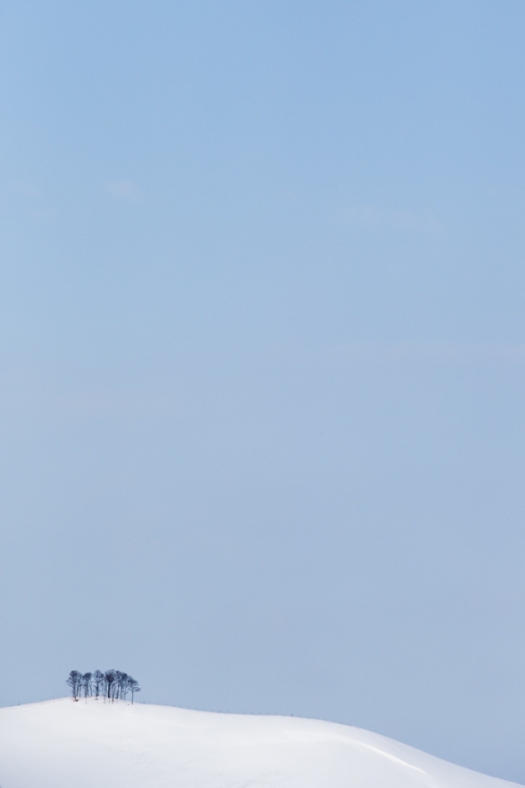
While getting closer was certainly an option I had an opportunity to use the new 100-400 lens and made the image below using the same settings as I had with my 70-200mm. Nixon_150115_6462

Immediately noticeable on the LCD screen on the camera was that the image made using the 100-400 was sharper than that made with the 70-200 even though all the camera settings and lens settings were the same. This in inevitably led me to wonder what if I dumped the 70-200 and replaced it with the 100-400 lens. That way I’d have a nice sharp lens capable of the extra reach when I need it. My only concern is the weight – a chunky albs. We’ll see how I get on!

Friday Inspiration: Nobuyuki Kobayashi

Screenshot 2015-01-28 14.10.19

In continuing my exploration of Japanese photographers I recently came across Nobuyuki Kobayashi. Kobayashi may be most well known for his work in magazines as a portrait photographer or for his humanitarian work but what caught my attention were his black and white landscapes. Landscape might be the wrong word, since for many it evokes the grand view and Kobayashi’s work offers a much subtler take on the land. He feels that he is taking portraits of the Gods and this delicate approach certainly comes through in the work of his that I’ve seen so far.

I find his process intriguing – use of an 8×10 large format camera, film and printing on traditional Japanese paper, washi. I’ve tried printing on washi in the past and found that the heavy intrinsic texture works against many subjects but Kobayashi seems to be making it work. It rails against the increasingly small format, mirrorless digital cameras and yet his choice of materials that should last for hundreds of years supports his goal of using photography as a tool to preserve the beauty of the natural world.

I’m hoping to see more in the book that accompanies this body of work ‘Myriads of Gods’.

Listen to Kobayashi describe this project in the short interview below and watch the longer documentary for a behind the scenes look at his process of platinum palladium printing on washi.

(English sub)Portrait of Nature – Myriads of Gods on Platinum Palladium Prints – from augment5 Inc. on Vimeo.

From The Road

Nixon_150104_9247

I’ve been traveling in Japan for the last week and will be in Japan next week too. I’ve been having fun – making photos quite literally from the road.

Friday Inspiration: Christian Fletcher

Fletcher

A section in a book that I’m reading at the moment provided a twist to the ‘you’re the average of the 5 people you spend most time with‘ idea that has been circling the internet for several years now. Specifically it said that if you’re the smartest person you know then you need to get to know some more people, if you’re the most creative person you know then you need to get to know some more people and went on like that for quite a bit. It’s funny that the Ninety Degrees Five group is five people – all are very talented and successful, if the alphabet soup of letters that they are able to append to their names is anything to go by – I wouldn’t mind being the average of this group by any means!

Of this group Christian Fletcher recently won Western Australian Landscape photographer of the year and International Landscape photographer of the year. He’s based in Dunsborough in South Western Australia, which looks like a fantastic part of the world if his photographs are anything to go by and is now on my list of places to visit. Christian seems to work predominantly with digital medium format cameras, which allows him to create large prints of his work, working with photoshop to fully extract the potential in each of his images. Check out the videos below to hear more from Christian himself.

Phase One – Christian Fletcher from Michael Fletcher on Vimeo.

Beavertail Lighthouse Scouting Trip

Nixon_141120_4498

What’s the weather like where you are? Here on the New England coast it’s been bitterly cold this last week – a polar vortex the weather guys seem to call it. I was in Jamestown recently to photograph around Beavertail lighthouse with the temperature cold and feeling colder because of the wind chill.

This was the first time that I’d actually gone to Jamestown with the intention of photographing around the lighthouse and, although I had prepared as well as I could, I wasn’t prepared for the difficulties that the cold would present. I was playing with the 24 mm tilt-shift lens again but what I quickly found was that I was too clumsy with gloved hands to operate the buttons and knobs that you need to work to adjust the lens. I struggled along the best that I could but was very frustrated by the time I was done.

I did however get a couple of images that I liked and managed to find a couple of fun spots that I plan to return to in the coming weeks.

Friday Inspiration: Tony Hewitt

THEWITT-Canal-Rocks-1-WA

I’ve enjoyed poking around on Tony Hewitt’s website as part of learning more about the photographers that make up the Ninety Degrees Five collaborative group. Tony is a wedding and portrait photographer although it’s his landscape and fine art work that I’m drawn to. I was curious to see that he isn’t just what I consider a ‘straight shooter’ but is will to add textures to his photographs and really push them to get the feeling he’s looking for in his photographs. I wasn’t expecting that from some of the work that I’d seen of his as part of the ND5 exhibitions but it just goes to show that it’s worth digging in to get a better sense of the breadth of work people are doing. Check out the interview and other videos of Tony below.

Tony Hewitt, “Keep Looking For Your Style…” from AIPP TV on Vimeo.

The Pilbara Project – Tony Hewitt from Michael Fletcher on Vimeo.

Tony Hewitt and Christian Fletcher talking about the Pilbara Project – Photographers Cut exhibition from Michael Fletcher on Vimeo.

Friday Inspiration: Hobie Porter

porter_resorption_oil-polycanvas_135x120cm_2011

When I first saw Hobie Porter‘s work I wasn’t sure what I was looking at – a ‘straight’ photograph, a digital mash-up or what. He is of course a landscape painter, and his work is a juxtaposition of the grand landscape with artifacts that he’s found. Perhaps not surprisingly what caught my attention are his seascapes in which he incorporates old ropes, propellers and a variety of other things that he’s found at the beach. One of the advantages that painters have over photographers is that they are able to paint what ever they imagine and so I had assumed that these beach artifacts were figments of Porter’s imagination. Not so. While there may be an element of interpretation he actually collected these objects for use as reference and then for the exhibition shown in the video below displays them as part of the exhibition. Check out the videos of Porter at work and of him discussing his art below.

Hobie Porter ‘Continuum’ from Arthouse Gallery on Vimeo.

Hobie Porter ‘Full Circle’ from Arthouse Gallery on Vimeo.

Friday Inspiration: Arturo Chapa

Horse and Rider

Over the past few weeks I’ve been thinking about, and continue to think about, book design. What are the elements of a good photobook? I have lots of photobooks to look at and I continue to work through them identifying the elements that work and don’t seem to work.

I was very interested to hear the discussion that Michael Reichmann had with book designer Arturo Chapa regarding the preparation of Reichmann’s 20 year retrospective book, the proceeds of which will be used to seed the charitable foundation ‘The Luminous Endowment for photographers’.

Chapa has a number of interesting things to say about his philosophy of designing books. The most pertinent for me was his assertion that you shouldn’t see the design. If the book is well designed you just see the images. You don’t see the design, you don’t notice the quality, you just see and remember the images. It’s all in support of the content. Check out the video below for more about how Arturo Chapa thinks about book design and manages the process of getting the book printed to the standard that he demands.

Making the Book: Michael Reichmann – a 20 year Photographic Retrospective from The Luminous Landscape on Vimeo.