Playing with Presets Redux: Black & White Preset Download

Nixon_130517_5888

When I originally wrote about using presets to explore the potential in my images I had intended on providing the final black and white preset that I made as a downloadable file. Unfortunately I couldn’t quite figure out how to do it. Should be easy enough right?

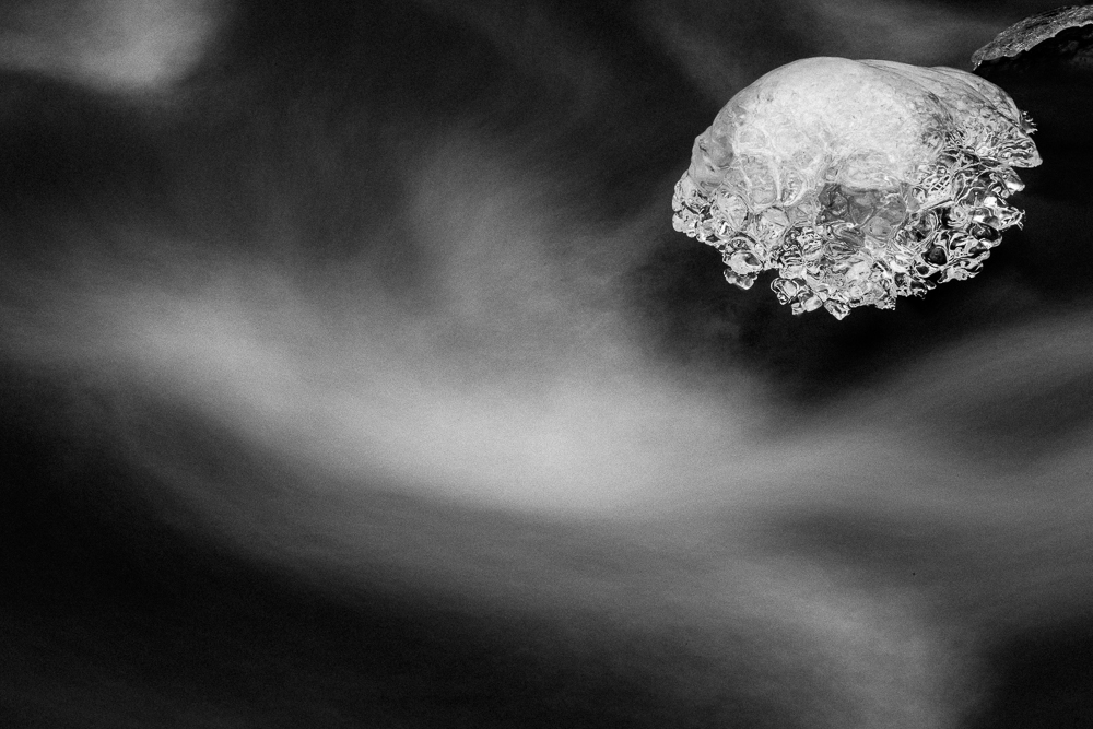
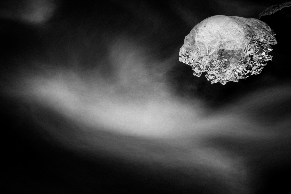
I continued to use the preset and have used it on all of my black and white images that I’ve posted here over the last few weeks, including the one above. Then finally I figured out how to provide the file.

Click here to download the preset and instructions on how to install it.

Installation of the preset is quite easy:

1. Open Lightroom

2. Navigate to the ‘Develop’ module

3. Find ‘User Presets’ in the presets panel on the left hand side.

4. Right click or control click on ‘User Presets’ to open a menu.

5. The menu has 2 options – New Folder and Import. Click import.

6. A file browser will open that will allow you to navigate to the preset you downloaded. Click on the preset you wish to import and then click ‘Import’.

7. That’s it! The preset should now be loaded into the ‘User Presets’ section of the Lightroom develop module.

To use the preset is easy enough. Select the image you want to work with, open the develop module (I usually just hit the ‘d’ key), under the user presets click on the B&W Preset. Done!

Of course sometimes you might be done, other times you might want to work the image a little more. The most common additional edits that I do are: apply lens correction, change the vignette – which is found under the effects panel on the right hand side, and to change the grain characteristics – also found under the effects panel.

You might want to do other things but I hope that this serves as a solid jumping off point. Let me know if you like this, how you’re using it, what works, what doesn’t. I’d appreciate the feedback.

Friday Inspiration: Sebastião Salgado

Sebastião Salgado’s new book Genesis was waiting for me when I got home from vacation. It’s an amazing book, that represents the culmination of an almost 10 year project to photograph mountains, deserts, oceans, people and animals that have so far escaped change the onslaught of modern society. The book, it’s 517 pages !, is organized geographically into five chapters : Planet South, Sanctuaries, Africa, Northern Spaces, Amazonia and Pantanal. As you might expect if you know Salgado’s work the photographs are lush black and white.

This interview on the Canon Europe website is an excellent read.

Watch Salgado discuss Genesis below:

Sebastião Salgado: Genesis from Edmond Terakopian on Vimeo.

Salgado talks at TED

Friday Inspiration: Alberto Placido

inscape01

While Alberto Placido’s commercial work focuses largely on architecture it’s his personal work that explores the natural world that I find most appealing.

The image above is the first image in the Inscape series. I have particularly enjoyed look at the work that deals with the coast (perhaps not too surprisingly), the very dark images of the ‘Invisible Landscape’ with highlights of white from the sky or breaking waves reminded me of my own pre-dawn visits to the coast, while those of ‘Between Sea and Sky’, such as the one below, give the sense of standing on the deck of a boat looking out at the ocean.

mar_e_ceu_011

Alberto’s video below is interesting and I’d love to see the still images that came from this trip.

Mist from Alberto Placido on Vimeo.

Friday Inspiration: Peter Schlör

schloer-reventon_2011

Any guesses where this photograph by German photographer Peter Schlör was taken? Any of my British friends recognize a popular summer holiday destination?

I recently came across Peter Schlör’s book ‘Black and Wide‘, a collection of very moody black and white photographs that if you’d told me were of the Pacific Northwest I would have believed you. But no, they were taken on the Canary Islands. I couldn’t believe it. When I think of the Canary Islands I think of it as a summer destination, the ocean, blue skies & bright colors. What you’ll find in these pages are images with very dark shadows, trees, fog and low clouds. It’s an amazing transformation. I’m looking forward to finding out more about Peter’s work.

I was pleased to find the video below of Peter and the team getting ready for an exhibit of the Black and Wide images but very disappointed to find out that it was all in German. Anyone able to help out with a translation?

In any case, it was interesting to see how the images were prepared for exhibition. This is one of the things that you miss out on when looking at images in a book, the scale of the final prints. It was interesting to see what an eclectic mix of sizes and presentation styles that were used and it makes me wonder why he made the choices he made. Worth a look even if you don’t speak German!

Look Behind You!

Nixon_130517_5332Look behind you is of course part of the standard audience participation in pantomime, a particularly English form of entertainment. It is also good advice to photographers because often good things are happening all around us and taking a moment to look up, down and all around can result in you spotting other good opportunities.

That was certainly the case for the photograph above. I was on the way to the Sol Duc falls and had stopped to photograph the mossy rocks that are part way to the falls. In taking a moment to look behind me I noticed that there was interesting light in the trees behind me. I shifted my attention to the trees for a little while and was fortunate enough to get a shot that, with the application of my standard B&W preset, resulted in the image at the top of the page.

So far I like this more than my mossy rock pictures and it just goes to show that looking behind you can pay off if you make a habit of it.

Friday Inspiration: Mary Randlett

Randlett

When I was poking around on Bainbridge Island recently I did a quick tour of most of the interesting shops on the main drag, Winslow street. I wasn’t looking to buy anything, my bags were perilously close to the 50lb limit imposed by the airline as it was, but rather looking. Looking for inspiration, looking for things that I could use later. In Bainbridge Arts & Crafts I came across a book by Mary Randlett called Landscapes that I thought was amazing.

Mary’s photography came to the notice of the public as the person who took the last photographs of the noted poet Theodore Roethke. She then went on to photograph Roethke’s students and other Northwest artists (including one of Johsel Namkung who I’ve written about previously), their artwork and architecture. As I understand it (from one of the essays in the Landscapes book) Mary’s landscape work was ‘personal work’, photographs that she made for herself and shared with friends as christmas cards. These photographs eventually were published in the Landscapes book.

What particularly appeals to me about Mary’s work is that there is little of the grand landscape here. The feeling is much more of someone who had spent time with the landscape, enough time to let the landscape reveal itself.

To see more of Mary Randlett’s Landscape work I highly recommend the Landscapes book. The University of Washington has some of her work online in their digital collection. As always let me know if you find a good resource that I missed.

Randlett_Beach

The Path Home

Nixon_130518_6502

Home again after what seems like quite a while in the Pacific Northwest. I’m still digesting what I saw and learned while I was out there, so be prepared for Pacific Northwest related posts for at least the next week or so. Just for the record my path home was car, boat, car, plane, car. Not tortuous, but it did involve a Viking Festival, which was a surprise.

Friday Inspiration: Andreas Feininger

Feininger

I’m continue to enjoy watching the 1983 BBC tv series ‘Masters of Photography’. This week I’ve been watching the interview with Andreas Feininger. Not surprisingly I was blissfully unaware of Feininger’s experimental photography, much of which we take for granted now. He is perhaps best know for his photographs of New York taken with a telephoto lens. Telephoto lens, what’s the big deal with that you say – I certainly did.

He started working with a telephoto lens in Stockholm. There, in order to get the images of the waterfront that he wanted he shot from over 3 miles away using a telephoto lens. At that time, around 1938, telephoto lenses were hard to come by and expensive, so he made his own camera. In New York working for Life magazine he used a 40-inch Dallmeyer telephoto lens, equivalent of ~1000mm,the compression of perspective that he got with this was quite remarkable. The image above is a good example of it.

In addition to his work outside with the telephoto lens, he took the idea inside to photographed close ups of nature, things that he found on walks on the beach. These are quite interesting in that they are not just records of what is in front of the camera, but he goes to some effort to stage the object in an effort to record what he feels about the object.

Take a look at the interview with Andreas Feininger in the video below:

Playing Around with Presets

Nixon_130208_0409-8

Rare are the days when the photograph that pops up in lightroom is close to what I had imagined it should look like and a few tweaks and I’m done. More common are the times where I have some playing to do in lightroom and then photoshop but I know where I’m heading and then there are those images that I just wonder what I was thinking. Believe it or not, the image above started out in this last category.

The image out of the camera is shown below.

Nixon_130208_0409

After a few moments of not really knowing what to do with it I started clicking through the presets built into the develop module. I haven’t been a big fan of presets preferring to know exactly what slider I was changing and why. Clicking around though it quickly became apparent that this photo should be black and white. The five built in presets gave the following ‘looks’.

Nixon_130208_0409-2 Nixon_130208_0409-3
Look 1 Look 2
Nixon_130208_0409-4 Nixon_130208_0409-5
Look 3 Look 4
Nixon_130208_0409-6
Look 5

I liked looks 2 and 3, with not a lot to choose between them for me. I chose version 3 as a starting point and made it a little darker and a little grainer. The image below was the result.

Nixon_130208_0409-7

A little bit more clean up and I was done. I must admit that this experience changed my outlook on presets. They’re great starting points, to be pushed further or dialed back, and invaluable to get a quick sense of what different processing could do to your image. Even better if you make your own and share with friends.

Nixon_130208_0409-8

Friday Inspiration: Bill Brandt

archive1

My intersection with Bill Brandt came by way of Michael Kenna. In a number of places I’d read that Michael Kenna was deeply influenced by Bill Brandt and yet when I looked up his work, much of what I found was nudes. Being very English and uncomfortable with all that nakedness, I left it at that. More recently I steeled myself for another look and found, in addition to the nudes, an eclectic collection of photographs from portraits to a look at society life to miners of the North of England to landscapes. It seems to me that Brandt’s later photographs became darker and more extreme in contrast, something that I assume he pushed in the darkroom. A good example of this is shown below:

Halifax Snicket

For fun click here to see Michael Kenna’s rendition of this image.

Many of Brandt’s images can be found on his website under the licensing section. Well worth a look. Also worth a look if you’re in or around New York is the exhibition of Brandt’s work at the MOMA ‘Shadow and Light’ that runs until August 12.

To hear Brandt talk about his work check out this 1983 BBC interview: