Friday Inspiration: Jim Denevan

jim-denevan-land-art-3
Jim Denevan is a chef and an artist. As a chef he is the founder and driving force behind the ‘Outstanding in the Field‘ farm dinners. The aim for the meals is to reconnect the diner to the land, to showcase the talents of the farmers who grow the food and the chefs who prepare it. Here’s a link to the companion book. They were in Boston this week visiting Island Creek Oysters but unfortunately I missed them!

As an artist Denevan creates some of the largest drawings on the planet. Working most often with sand on California beaches, but also in other parts of the world including Siberia (!), working quickly to beat the incoming tide he creates geometric patterns that because of their scale are best viewed from the air. Very impressive. Who ever said that crop circles couldn’t be man made has never seen a Denevan drawing. Check out some videos of Jim at work below.

Jim Denevan: Sand Drawings, Spanish Banks from Michael Cox on Vimeo.

Minimalism – Digging In

Not being ready to be done with a minimalist approach to life I decided to dig into a few of my favorite resources and wanted to share those here.

Zen Habits – Leo Babauta share’s his thoughts on living a simple life, quite a challenge given that he has six kids! I find the story of his transformation to a simpler, more frugal way of living began in 2005 to be truly inspirational. Check it out here.

Becoming Minimalist – Here Josh Becker shares the ups and downs of his family’s journey to ‘rational minimalism’. This link is a good place to begin finding out about Josh.

The Minimalists – I’m relatively new to The Minimalists and have been enjoying reading about their 21 day journey into minimalism. Check out their recent presentation at TEDx in Whitefish where they discuss community, consumerism, and living a rich life below. Some of the answers in the Q&A video, also below, definitely gave me hope that I’m on the right path.

Friday Inspiration: Lisa Congdon

Lisa Congdon Birch Trees

In many ways I feel as though Lisa Congdon is the heir apparent to Maira Kalman‘s throne. I’ve followed Lisa’s development as an artist for the last few years. I was late coming to the two projects that have fueled her career momentum, the first of which was ‘a collection a day‘ and then more recently ‘365 days of hand lettering‘. Lisa has a new book out ‘Art, Inc.‘ which describes the practical aspects of making a living from your art. Peppered with examples from her own transition from teacher to working artist as well as interviews with a number of other artists this is a great resource for any visual artist thinking about making the leap. What I realized from working through Art Inc. is that Lisa Congdon’s success hasn’t been a matter of luck but rather a result of showing up and doing the work everyday and most importantly sharing what she’s been doing with the world.

Check out the recent interview that Lisa had with Dane Sanders here, discussing her new book on creative live here and some additional videos of her describing her work below.

Friday Inspiration: Maira Kalman

franklin

I was familiar with Maira Kalman‘s work through the many New Yorker magazine covers that she’s done over the years. It wasn’t until I came across her a video describing her work recently that I connected the dots. It was fun to see that she had a blog for a while called ‘And the Pursuit of Happiness’ although it wasn’t through my dive into ‘what is happiness’ that I found her. Kalman has a unique painting style and her combination of words and images really works for me.

Check out more about Kalman in the videos below.

Friday Inspiration: Arturo Chapa

Horse and Rider

Over the past few weeks I’ve been thinking about, and continue to think about, book design. What are the elements of a good photobook? I have lots of photobooks to look at and I continue to work through them identifying the elements that work and don’t seem to work.

I was very interested to hear the discussion that Michael Reichmann had with book designer Arturo Chapa regarding the preparation of Reichmann’s 20 year retrospective book, the proceeds of which will be used to seed the charitable foundation ‘The Luminous Endowment for photographers’.

Chapa has a number of interesting things to say about his philosophy of designing books. The most pertinent for me was his assertion that you shouldn’t see the design. If the book is well designed you just see the images. You don’t see the design, you don’t notice the quality, you just see and remember the images. It’s all in support of the content. Check out the video below for more about how Arturo Chapa thinks about book design and manages the process of getting the book printed to the standard that he demands.

Making the Book: Michael Reichmann – a 20 year Photographic Retrospective from The Luminous Landscape on Vimeo.

Friday Inspiration: Norman Ackroyd

Ackroyd1

It is surprising to me that in the UK there is a TV series that answers the question “What Do Artists Do All Day?“. Perhaps we really are living in the era of the creative as Chase Jarvis tells us. Having blown the best part of a day watching these videos my favorite had to be the one that shows printmaker Norman Ackroyd producing one of his large scale prints. In reading about David Hockney I was fascinated to learn more about the etching process to prepare prints and to see a master in action, in the videos below, adds another level of understanding. It’s amazing to me that such delicate watercolors can be produced by working on a copper plate with the added level of complexity that the work on the plate has to be done in reverse. Ackroyd has his reference image set up in a mirror to facilitate this seeing in reverse.

I was struck by the nature of Ackroyd’s project – to make images of the outlying islands of the British Isles – and that he tracks where he’s been using push pins on a map of the british isles. This of course has parallels with the Atlantic Basin project of Thomas Joshua Cooper. His work references watercolors that he’s made on location which is quite an undertaking in itself. A collection of his watercolor sketches from the Shetland islands is available and this work will be the subject of an exhibition later in 2014.

Check out a day in the life of Norman Ackroyd in the videos below.

Friday Inspiration: Albert Watson

Watson2

I was poking around on the Phase One website recently (more about that in an upcoming post) when I came across a pair of videos (here and here) of Albert Watson working with a Phase One camera system to make landscape images. I felt as though I knew the name but it wasn’t until video 2 that it dawned on me from where. Albert Watson, as I’m sure you’re well aware, is perhaps best know for his fashion and celebrity portraiture. The photograph that kicked his career into high gear was of Alfred Hitchcock holding a plucked goose and the photograph that I was most familiar with was the photograph of Steve Jobs. It was surprising then for me to see this icon of celebrity portraiture out in the wilds of Scotland taking landscape photographs and a reminder of how important it is to sustain a long a fruitful career to find the things that are out of your everyday, that energize and push you and make the time for these things.

I also found an additional documentary that features Albert Watson’s landscape work that was shown on BBC4. I must admit to scratching my head a little about that one – I can remember when there were only 3 tv channels in the UK and BBC2 was a little out there. The documentary has lots of take aways including: “Always have two assistants, that way if one falls off the mountain you have a spare” more seriously was his way of having a series of words that he uses as an intellectual framework for what he’s trying to achieve with the project. Something that we all can use right now. Check out the documentary below:

Mind The Gap

Ira Glass on Storytelling from David Shiyang Liu on Vimeo.

I have a couple of photography related book projects that should see the light of day by the end of the year and need to prepare the files for printing. To that end over the last week I’ve started aggregating the materials that I’ll need to start teaching myself the rudiments of InDesign. Now I’m feeling a little overwhelmed and stalling beginning the learning process.

I love books, so much so that my kids have asked me on more than one occasion whether I’m going to open a library, and being in a position to make my own is an amazing opportunity. But here’s the thing, I’ve spent a long time learning how to make my camera do what I want it to do which meant a long period of knowing what it was that I liked but not being able to get there – the Ira Glass video above is an apt description of this gap.

Does this apply to book design? Certainly, there are lots of tiny decisions that have to be made from small typographic questions such as whether or not to use ‘&’ in the title and what font to use to larger layout questions. Without getting these right the result will be jarring even if you couldn’t quite put your finger on what the problem is. Your work will suffer by how it’s presented.

While the answer of course is to make lots of books and test them in a safe environment, what to do for projects where you don’t have the time for those cycles of improvement?

I’m tempted to look for a book designer that I can work with to help me bring my first projects to life while I learn the rudiments of the software and the design process so that the books that I make present my work in the strongest way possible. What would you do?

Friday Inspiration: Carleton Watkins

20140610-212556-77156632.jpg

I can’t remember where I first read about Carleton Watkins, perhaps it was this article in the Smithsonian magazine.  For someone like me, who thought that photography started with Ansel Adams, it was something of a revelation to read about and see Watkin’s photographs of the American west and particularly of Yosemite Valley.  While many of his photographs are stereograms the views of Yosemite are quite familiar.  It was his series of photographs of Yosemite Valley in the 1860s that helped influence Congress’s decision to make the valley a National Park in 1864.

There’s an exhibition of Watkin’s photographs at the Cantor Arts Center at Stanford University until August 17.  To find out more about the exhibition see here.  Unfortunately I’m in the wrong part of the country to be able to get to the exhibition but I did get the related book and have been enjoying looking at the photographs.

Recognizing many of the views made famous through the work of Ansel Adams in the Yosemite Valley made me think about what Ansel Adams brought to the table.  Perhaps not his vision but his superior control of the medium and printing abilities?

Check out the video below for more details on the exhibition at the Cantor Arts Center.

Friday Inspiration: Carl Chiarenza

chiarenza
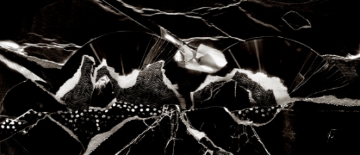
I’ve been looking at work by Aaron Siskind over the last few weeks and as part of that reading came across Carl Chiarenza who wrote ‘Aaron Siskind: Pleasures and Treasures’. Chiarenza is a splendid photographer in his own right in addition to being a great teacher. Check out the video below to get an introduction to Chiarenza. Check out the additional conversations between Chiarenza and Brooks Jensen that can be found here.

A Conversation with Carl Chiarenza from Rochester Contemporary (RoCo) on Vimeo.